Inside the Process: The Voice of Tomorrow
Date: April 2026
Winner of the Swift Student Challenge 2026, The Voice of Tomorrow is a voice-led immersive experience conceived, designed, and developed by me, built with accessibility in mind from the start, and now available on the App Store for iOS, iPadOS, and macOS.
What if your voice was not something to fix, but something to hear differently?
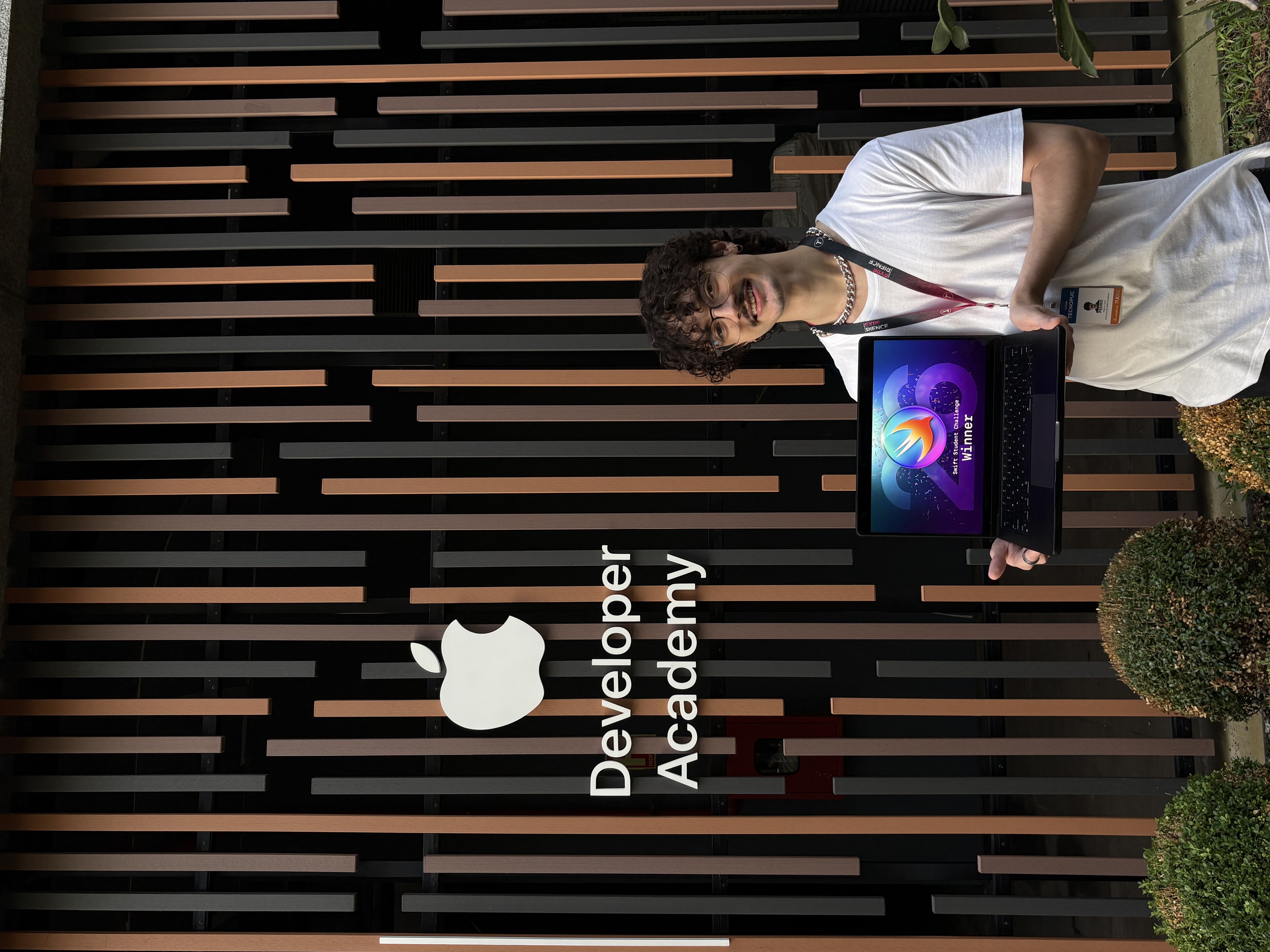
Presenting The Voice of Tomorrow as a project recognized as a winner of the Swift Student Challenge 2026.
Intro
I created The Voice of Tomorrow as a solo project for the Swift Student Challenge 2026, where it was recognized as a winner of the Swift Student Challenge 2026. But the idea behind it started much earlier.
Growing up with a stutter shapes more than the way you speak. It shapes how you see yourself. For many, voice becomes tied to hesitation, fear, or the physical feeling of being interrupted by your own body. Over time, speaking starts to carry a weight it shouldn't.
This project was born from that tension. It is not a clinical tool or a speech correction app. It is an immersive experience designed to invite people to hear their own voice with less fear and more acceptance. From the beginning, my goal was to explore how a voice-based product could feel less evaluative and more humane.
It was also important for the work to reflect the full scope of my role: this was an authorial project I developed end to end, across product thinking, UI and UX design, and implementation in SwiftUI.
Context
Most voice-related products are built around performance: fluency, correction, repetition, improvement.
But that is not always what people need.
While shaping this project, I kept returning to a more human question: what happens when someone spends years feeling that their voice is a problem to solve?
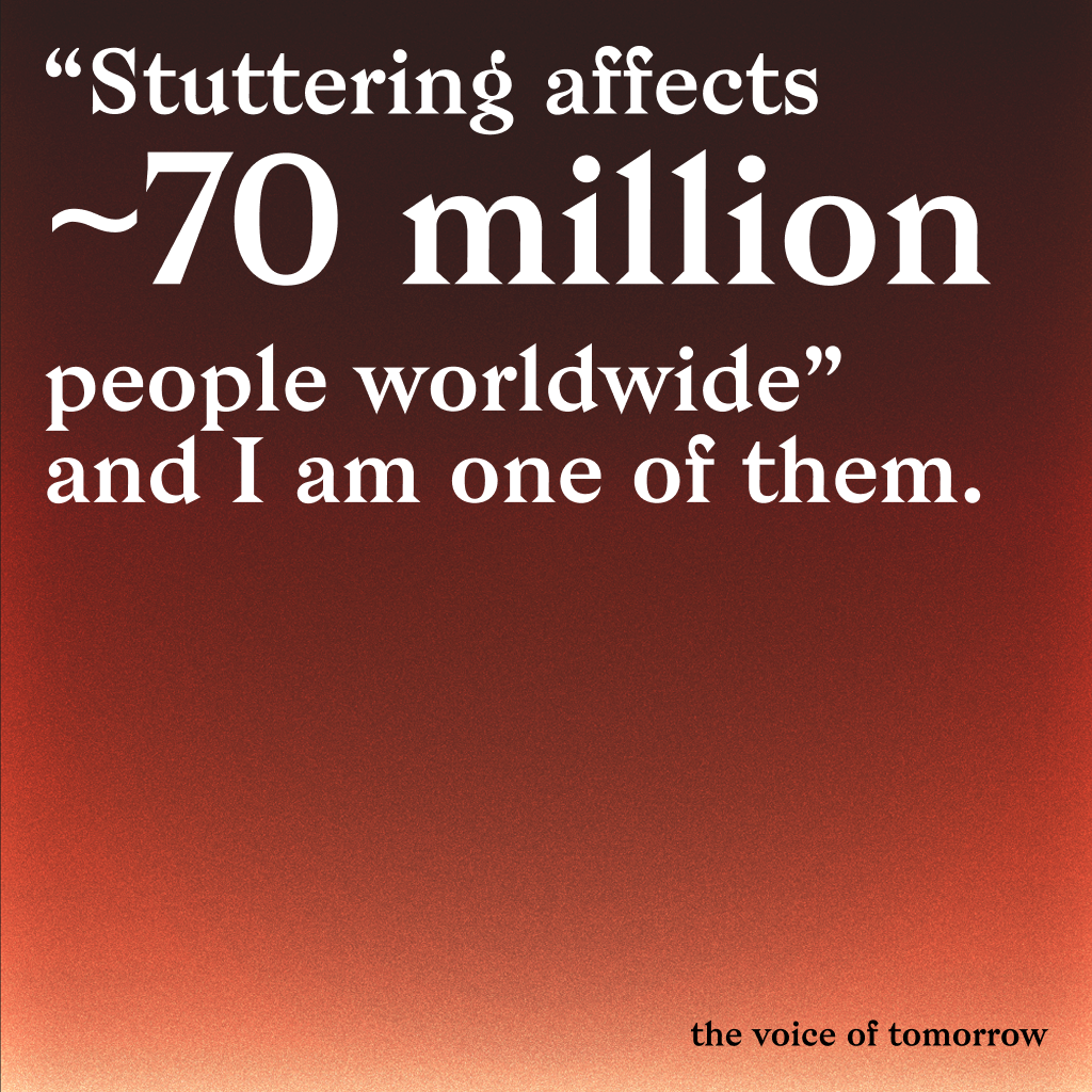
Stuttering affects around 70 million people worldwide (ABrAGagueira) and about 2 million people in Brazil (G1), yet many available solutions still focus more on correction than emotional acceptance.
That is where this project begins.
Instead of designing another utility, I wanted to create something more intimate, reflective, and emotionally honest, especially for people who stutter and rarely see their inner experience represented with care.
Problem Statement
Many people who stutter grow up feeling that their voice is broken, embarrassing, or less valuable.
Most existing alternatives either feel too clinical or too generic. They focus on fluency, but often ignore identity, shame, self-censorship, and the emotional weight of being heard.
Solution
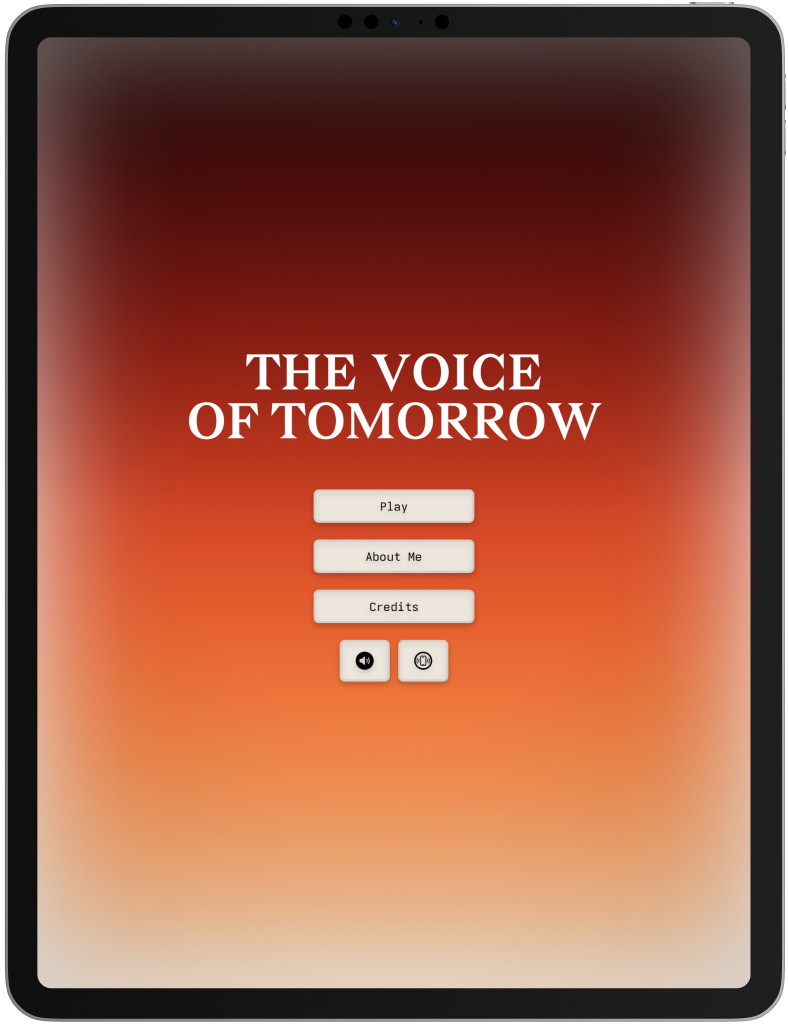
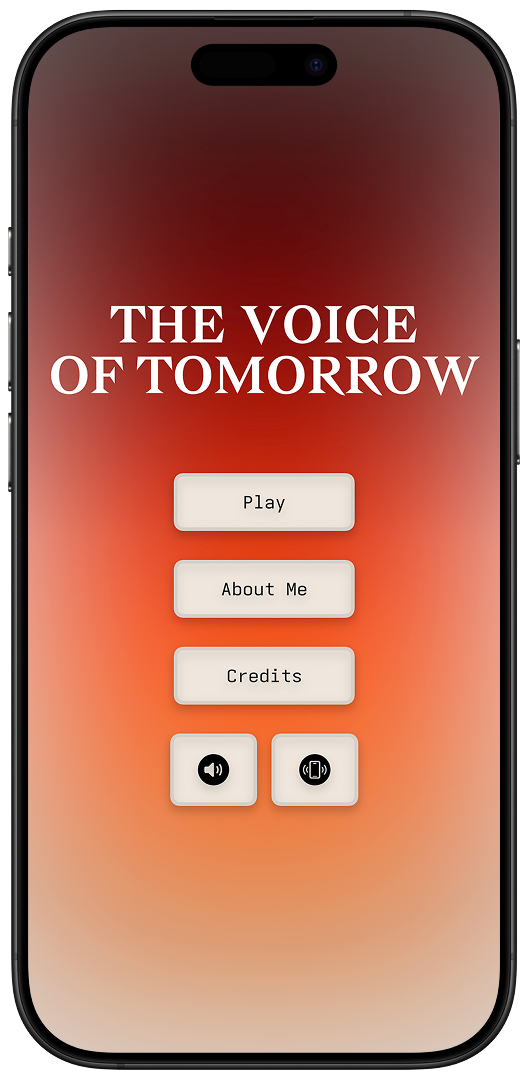
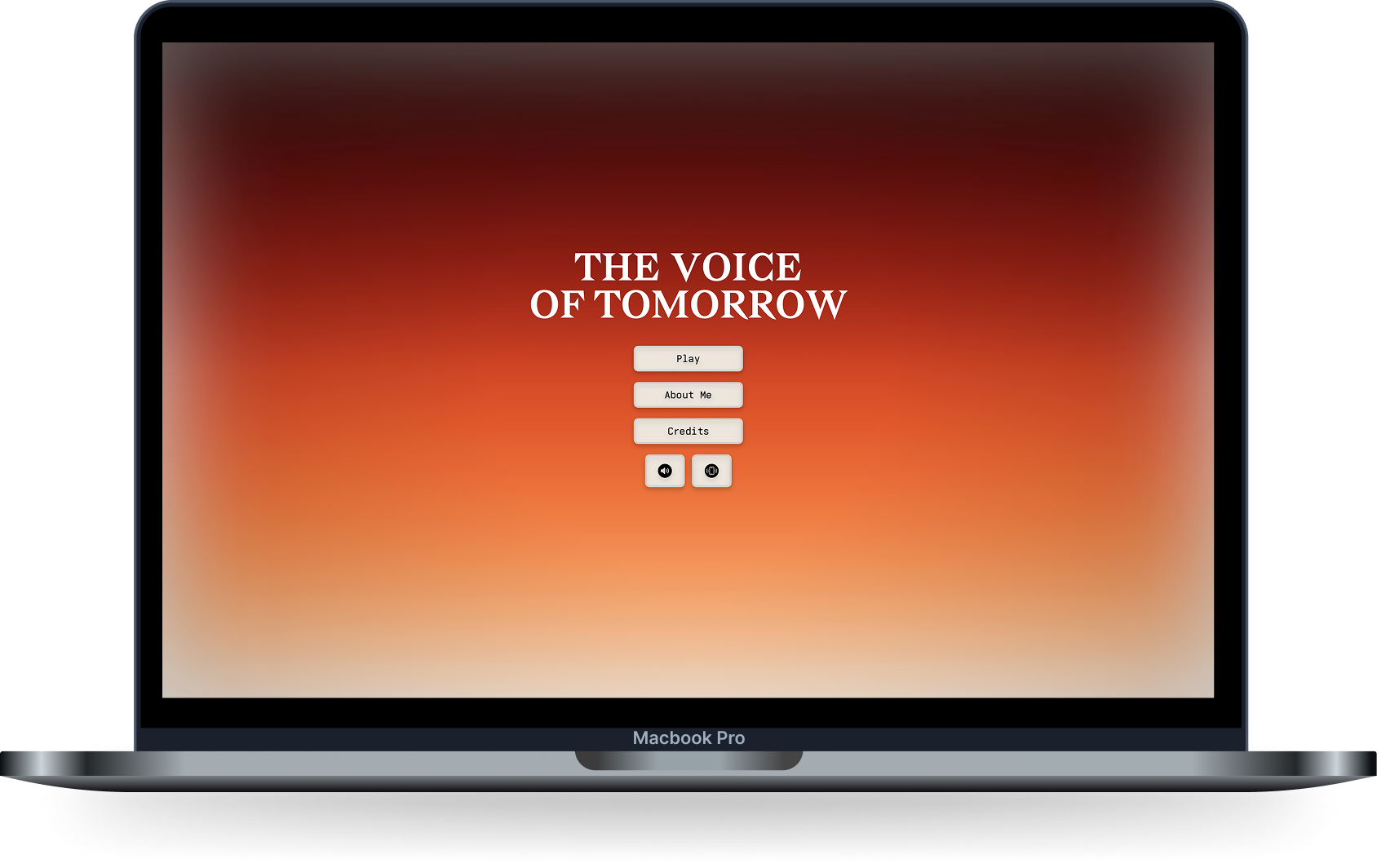
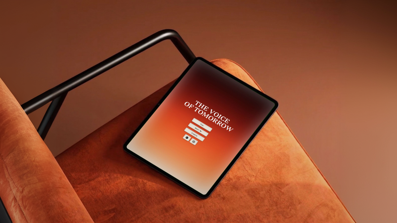
The Voice of Tomorrow is a voice-led immersive experience designed for iOS, iPadOS, and macOS.
The app guides the user through a short cinematic journey where speech, pauses, doubt, and courage become part of the interaction itself.
Rather than treating the voice as an error to eliminate, the experience responds to it as expression.
That became the core design decision behind the project: to create something that listens without judging.
Because the experience revolves around voice, accessibility had to be built into the concept itself.
I did not want speech to feel mandatory. Key moments can also be navigated through touch, offering another path for users who may not feel comfortable speaking out loud.
The videos below show part of the macOS experience in both English and Brazilian Portuguese. They also reflect an important product decision: language was treated as part of the experience from the start, not as a layer added later.
Please turn on your sound to experience the interaction as intended.
English
Português (BR)
The result is not therapy, and it is not a productivity flow. It is a narrative interaction centered on voice, presence, and self-acceptance.
To make that intimacy work across contexts, the experience was built with native English and Brazilian Portuguese localization.
From Challenge to Release
The project began as an authorial exploration for the Swift Student Challenge 2026, where it was recognized as a winner of the Swift Student Challenge 2026.
As the work evolved, it moved beyond a submission and became a real product released on the App Store for iOS, iPadOS, and macOS.
That shift changed the nature of the project. It was no longer only about expressing an idea, but about shipping a polished, platform-aware, localized, and accessible experience that people could actually download and use across Apple platforms.
The iPhone version below shows how the product translated across devices and languages while preserving the same emotional tone.
Publishing it required a different level of product thinking: refining flows, adapting the interface across platforms, and making the experience resilient enough for real use.
Swipe to compare.
The iPhone experience across English and Brazilian Portuguese.
Two app icon directions explored during the transition from concept to release.
Ready to experience it? You can download The Voice of Tomorrow on the App Store.
Design Direction
From the beginning, I wanted the experience to feel:
- intimate
- atmospheric
- emotionally grounded
- respectful of silence, rhythm, and hesitation
That meant designing beyond screens alone.
Voice, timing, visuals, transitions, and pacing all needed to reinforce the same idea:
your voice matters, even when it trembles, pauses, or gets stuck.
Some of the visual direction was informed by references like Dune for its sense of silence, scale, and ritual, and Deadlock for its tension, contrast, and graphic sharpness. I used those references less as aesthetics to imitate and more as cues for tone, pacing, and presence.
Accessibility was central to that direction. Even with a strong editorial visual language, the interface follows a simple rule: under stress, preserve meaning first, interaction second, and composition last.
Drag to compare.
Dynamic Type in practice: default text size on the left, maximum accessibility scaling on the right.
That principle is visible in typography. The layout was designed to remain resilient with Dynamic Type, including at the largest accessibility sizes, so the narrative stays readable without truncation or loss of structure.
User testing also revealed moments where the rhythm of the interface needed more care. On iPhone, that led to a small but meaningful improvement: synchronized auto-scroll between both terminals, so users did not need to keep adjusting the screen to stay with the experience.
Swipe to compare.
Reading rhythm comparison: manual scrolling on the left, synchronized auto-scroll on the right.
Offering touch-based choices in key moments came from the same principle: voice should feel invited, not required.
A touch-based path for moments when speaking aloud may not feel comfortable.
The same principle shaped localization and platform adaptation. The app was designed to remain intentional across iPhone, iPad, and Mac, with support for English and Brazilian Portuguese, so the emotional tone could stay coherent across devices and audiences.
Reflections
This project changed the way I think about product design.
Instead of optimizing tasks, I was designing for emotional resonance. Instead of removing friction at all costs, I had to understand which pauses and moments of vulnerability were meaningful to preserve.
It reminded me that technology does not always need to solve a problem through efficiency. Sometimes it can create space for recognition, courage, and a different relationship with oneself.
For me, that became the most important lesson of the project: design can also be an act of listening.
Technologies & Tools
- SwiftUI - interface development across iOS, iPadOS, and macOS
- Speech Recognition / Microphone Input - voice interaction
- Touch-based interaction paths - alternative input for key moments in the experience
- Figma - concept, interface, and experience design
- Localization - English and Brazilian Portuguese support through String Catalogs
- Accessibility-oriented design - more inclusive interaction patterns across voice, touch, layout, and readability
Credits
Design & Development: Pedro Kosciuk Lima
Project Type: Authorial / experimental interactive experience